

KP Snacks is reinvigorating the Butterkist brand with updated packaging across its entire portfolio.
The brand refresh is launching with an eye-catching and modernised new look and feel. The design introduces the new tagline, "Creating Smiles Since 1914", highlighting Butterkist’s established heritage .
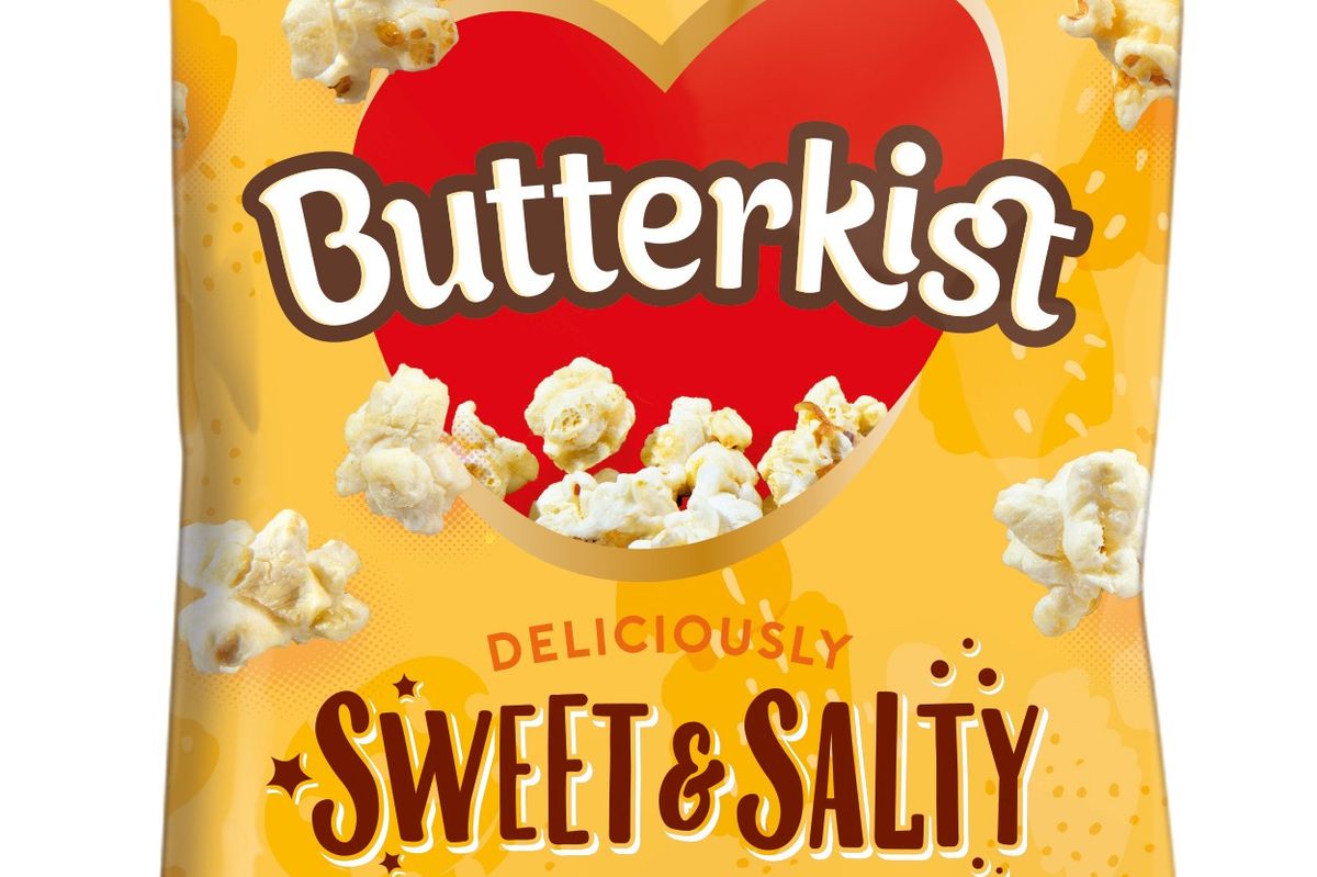
Bringing the "bursting with irresistible enjoyment" brand positioning to life, the redesign introduces new vibrant colours to both Sweet and Salted flavours. Solid colour backgrounds have been replaced with more visual patterns, alongside a more playful font. The Butterkist heart has also received an update.
Butterkist particularly popular as a sharing snack and with sharing occasions growing at +21 per cent, the Butterkist redesign comes at the perfect time to capitalise on these occasions and drive consumer purchases. 91 per cent say spending time family time together is very important, and 48 per cent say snacks are a must-have for an evening in with family.
“With sharing occasions increasing as a result of spending more time home, we have remained focused on improving the in-home experience and in keeping Butterkist top of mind when choosing a snack for those nights in," said Kevin McNair, Marketing Director at KP Snacks.
Worth £1.56bn, the largest within CSN, the sharing segment is currently experiencing growth of +13.6 per cent. At twice as large as its nearest branded competitor, Butterkist enjoys a 38.2 per cent share of it. The Butterkist brand is worth £52.7m RSV and growing in value +18.3 per cent.